climate change


We’d better use it wisely:

Yeah, that’s me.

Here’s a straightforward approach to dealing with denial. Most of these points make sense to me:

Tips for dealing with denial

  • Communicate a consistent message. Do not attempt to “soften the blow” too much, by making the issue seem less than it is.
  • Try not to provide too much information at one time. This sometimes can overwhelm [deniers]. Keep the first meeting as brief and succinct as possible, and end with the scheduling of a follow-up meeting.
  • Ask open-ended questions, and allow [deniers] plenty of time to talk. Undoubtedly, they are fearful of losing something very important—health, independence, or optimism/faith about the future.
  • Explain to [deniers] that information is something that you can provide, but that it is their choice what, if anything, they want to do with the information provided. Ask them what they want to know about, and let them guide the conversation.
  • Provide reading materials, which [deniers] can peruse at their own discretion.
  • End your meetings with [deniers] positively, and try to instill in them a sense of self-confidence in their abilities to [deal with the problem].
  • Recommend support groups, whenever possible.
  • Make it clear that the [problem] will never “go away,” .. but emphatically explain that [solutions] can lessen the severity of the [problem].
  • Explain to [deniers] that even if they do not believe that [the problem exists], the recommendations that you are making certainly will not harm them in any way. Ask them to humor you by making an attempt to follow your advice for a little while.
  • Know that [people] in denial often will refuse to admit that they are upset. They claim they are not upset—after all, nothing is wrong. Ask them how they would feel if they really did have the [problem] that they are denying that they have.
  • Remember that tough love often does not work with [people] in denial. Many [authorities] have said, “There is not much use talking to you right now. Just call me when you accept that  __________.”  They never hear from the [denier] again. Do not expect that [denier] will independently have a sudden insight. However, you can say, “I feel like you have other things on your mind today. We can talk more about this tomorrow at noon. Please feel free to call me if you have any questions before then.”
  • Expect [deniers] to direct their anger at you. Many times when you try to deconstruct their carefully built wall of denial, [deniers] will become angry. Do not react to this anger.

Some pretty sound advice there, I reckon. Some of it I’ve already seen in action in climate circles, some not.

The source? Medical clinical denial advice.

I wonder why more climate advocates haven’t looked at this kind of thing? Seems like a fairly obvious starting point, even if it can’t be linearly extrapolated to large groups…

The IPCC is being reviewed by the Interacademy Council (which represents dozens of national science academies). And they’re taking public comment. This might be a good chance to get some improvements. The comments form is at:
http://reviewipcc.interacademycouncil.net/comments.html

If you can’t think of anything, here’s what I wrote:

  • The IPCC needs to report more frequently. Interim reports, or even annual updates would be very useful.
  • More focus on possible tipping points. Especially estimates of sea-level rise from glacial melt, and estimates of non-linear responses to warming.
  • More transparency with the process – especially which representatives are making which changes to the finial release.
  • Stop being so conservative. Offer an your analysis, and be prepared to defend it when it gets attacked by the fossil fuel lobby and governments.
  • Work with science communicators. Create a lay-person’s version of the report.

Of the three announced national carbon targets I’ve heard of lately, two are arithmetically worse than Kyoto targets, and one is technically worse. The latter is Australia’s target, already discussed here.

The others are the recent US announcement, and the recent China announcement.

The US announcement was for a 17% cut, which sounds a bit better than the Kyoto US commitment (or non-commitment, as it turned out) of 7%. But it’s not really better, because it’s on 2005 levels, where as Kyoto was based on 1990. As it turns out, the US target, compared to 1990 levels is only about 5.5%, so it’s worse than the Kyoto target, and it’s 8 years later.

China’s announcement was for 40%, which sounds pretty good (and ok, since they didn’t have a target for Kyoto, it’s not really technically logical to call it worse), BUT. China’s target is relative to GDP. And China has a phenomenally high GDP growth rate, that 40% grows less meaningful every year. Even if China’s growth rate was close to average, like 3%, that 40 percent would be more or less nothing by 2020. China’s growth rate isn’t average though, it’s massive – 9% in 2008.

I’ve started collating ruses like these on envirowiki. If you know of any others, please edit that page and add them

There’s a pigeon nesting in the apple tree in my yard. The pigeon has already laid its eggs – two creamy pink ones. The apple tree hasn’t dropped it’s leaves yet – some are yellow, some are still green. It’s the 7th of July – the middle of winter.

Granted, both species are introduced, and the apple is some bastardised cross-breed grafted Frankenstein, each graft of which seems to bud, fruit and drop leaves at different times (which makes it very difficult to know when to prune it). But the image is pretty bizarre. I reckon the pigeon isn’t going to be happy when the rest of its cover is blown. Not that there are many predators in the suburbs.

Weird world.

This is in response to a discussion about population control and climate change on an e-list I’m on. In particular, it’s in response to a line by a mate, Jono:

it’s not the number of people that is important, but rather the power of the argument. Population control arguments need to be challenged wherever they occur, because they turn the climate movement into a war against human rights rather than for human rights.


Population control doesn’t have to infringe human rights. Some of the best ways of reducing the rate of population change are PRO-human rights: accessible education, equality in power relations between men and women, access to contraceptives, the aged pension.

Population is inseperable from environmental impact – if the population is low, but consumption per capita is very high, then you have a problem. If you have a really high population with small per-capita footprint, you still have a problem. At the moment, it’s obvious that the current global average per capita footprint is too high for the current population. The UN predicts 9 billion people by 2050, (150% of current population), which means that for us to have the same over all impact by then, we will need to have reduced our average percapita footprint to 2/3 of what it is now. To put this in perspective, current Australian GDP per capita is US$40-50,000, globally it’s about $10,000, so we’d have to reduce our footprints to about 15% of what it is now. That sounds doable, but that doesn’t take into account that we have to REDUCE our over-all impact, not keep it steady. (I realise I’m only talking about averages, but I think median figures would likely show even greater disparity).

There’s no reason why population control has to happen in the third world. It doesn’t matter where it happens. In fact, it’s probably better that it happens in the rich minority world, ’cause one less person here is heaps more impact reduction than the same person in the minority world. And that could potentially mean we have more room for refugees (not that population is the barrier now).

Ultimately, it’s about how you do it. Of course there’s plenty of fucked up ways to control populations. But the same can be said for any problem (Green Dictatorship, anyone?). We definitely shouldn’t be supporting any kind of punishment/penalties for people who feel the need to have more kids, but we should definitely encourage any positive measures that would help to slow down population rates, and oppose those that do the opposite (like Costello’s ” one for Mum, one for Dad, and one for the Country” – ugh… how would you feel to find out you were the one for the country?)

Seems to me that reducing populations and rates of change should definitely be a part of any broad climate campaign. We just have to make it abundantly clear how we mean to go about it – ethically and compassionately.

CFMEU rejects carbon trading job claims – ABC News (Australian Broadcasting Corporation)

The Construction, Forestry, Mining and Electrical Union (CFMEU) says the release of figures warning that emissions trading will cost thousands of jobs is part of a scare campaign.

The Minerals Council says emissions trading will cost 23,000 jobs in the next decade .

But the CFMEU’s Tony Maher says the Minerals Council is using the figures irresponsibly.

“Even on their own shonky report there’s a very significant growth in employment,” he said.

It’s nice, really nice, to see Tony Maher from the CFMEU being honest. The Minerals Council are spinning this for all it’s worth, even though they’re getting more than they asked for in the CPRS. The CFMEU has run spin campaigns with the Minerals Coucil before, but obviously they aren’t as conjoined as it previously seemed.

Also worth noting that on Stateline tonight (I’ll link to the transcript when it goes up), solar researchers are planning to start a PV cell manufacturing industry, which they estimate will provide 70 construction, and 120 jobs. They also estimated that such an industry could eventually end up providing 40,000 jobs (if I remember the figure correctly).

That’s what I call an offset.

I’d like to declare here and now that I’m sceptical about the “reality” of the round earth. There are many dissenting voices, sceptics of the current “consensus”, and significant evidence to show that the earth is not round. Not to mention that it’s bleedingly obvious – just look out the window: No curvature there, eh?

But despite this, dissenting voices in the debate are silenced. Proponents of the round earth hypothesis pursue their beliefs with a zeal unmatched even by the world’s most fundamentalist religions. While it’s true that many scientists believe that the earth is round, there are also significant dissenting voices, but were one to mention this in general conversation, or on talk back radio, one would immediately be shouted down, cut off, ostracised. In short, censored.

This is not how science should operate. Science is not decided by majority opinion, but by healthy debate. And while one side is being censored, there can be no real debate.

I’m not saying definitively that the earth flat or round – I’m still undecided, just that the debate needs to be opened up, so the true process of science can run its course, with maximum access to evidence and competing theories from both sides. Until all the information is on the table, I’ll be most skeptical of the majority-imposed “consensus”.


Sound familiar? The above arguments are frequently used by the denial-o-sphere (denial-o-plane?). While obviously climate change science is not so developed, or certain (or simple) as planetary physics, that does not mean that the above arguments have any weight in a climate context. (more…)

I’ve been starting to learn Octave, a maths programming language. Octave is similar to other packages that are often used to create nice graphs that you often see around the place, especially when it relates to climate change. This is a bit of a slap-dash tutorial on how to get some graphs happening with Octave. It probably assumes advanced high-school level maths.

If you wanna learn, I suggest you get QtOctave, which is damn nice, and in the Ubuntu repositories, and probably in most other distributions of linux (you can run Octave on windows – but if you really want to be this geeky, and are still on windows, you need to re-asses your values). QtOctave has a nice help-search function that lest you find most of what you need to know about functions, and installing it installs all the pre-requisites too, although depending on your distro, you might need some of the extra packages from octave-forge.

At the very bottom is an attachment with most of this code in it. I think most of this stuff will also work in Matlab, but you gotta pay for that…

Then read all of this excellent tutorial. That’s where I learned nearly everything for this tutorial, apart from the names of a few functions.

Crank out a graph!

Now you’re ready to go. Get yourself a copy of some temperature data to play with. I used NASA’s GISTEMP data. You can use any data you want, but I’ve attached a file that will do everything I’m talking about here, and includes octave-formatted GISTEMP data.

Ok, so assuming you’ve got your data in a matrix, you can then extract the relevant bits (Some of the variable names are different here to in the attachment, to save space):

% get the years from the first column
yr = GISTEMPdata(:,1);

(You did read that octave tutorial, right?)

% get the monthly averages
Temps =
GISTEMPdata(:,1);
% Average them, to get the yearly means (2 refers to the second dimension, ie. average rows, not columns)
AnnualTemps = mean (Temps, 2);

You can now hack out a simple graph:

plot(yr, AnnualTemps)
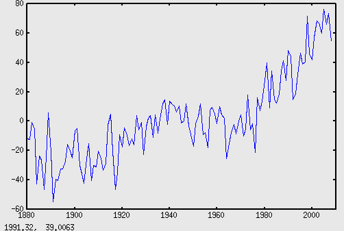
gistempplain

If you read tutorial, you’ll know how to adjust the axes, and add legends and titles, and all that jazz. I’m going to ignore that.

You’ll notice that the data range from -60 to 80. That’s because it’s a graph of temperature differences (anomalies) – which means that what matters isn’t the starting point, but rather, the relationships between the data. In this case, the -60 means -0.6DegC, and 80 means +0.8DegC (this is explained in the header of the GISTEMP file I linked to up top).

To change it to real values, to give it some human scale, we have to make the 1951-1980 average = 14DecC.

% Divide by 100, add 14, and subtract the average from the anomaly means
% 1951-1879 = 72, 1980 = 101
RealTemp = AnnualTemps / 100 + 14 - mean( mean( GISTEMPData(72:101,2:13) ) );
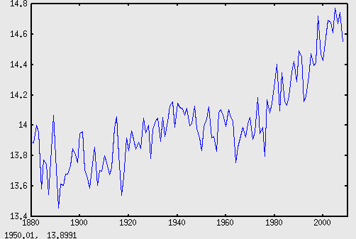
gistempsimple

Cool, huh? Okay, let’s get a Trend line going.

Getting Trendy

So, basically, a trend line is a best-fit line. You can do this automatically with a couple of functions in Octave, but since we’re going for just a straight trend line at the moment, we can just use a fairly simple one: a first degree polynomial fit. (a first degree polynomial is a straight line at any angle, from any starting point).

Polynomials are those equations you did in high school maths, that looked like:

y = x2+3x+1.5

That one would give you a basic parabola, shifted down and to the left a bit (I think, I haven’t actually graphed it). High-degree polynomials (where x is raised to the power of 2 or more) aren’t particularly useful for finding trend lines – they can look pretty, but don’t really help much. But more on that later. Simple first order polynomials (straight lines) are a good way of getting an idea of an overall trend.

To get the equation for the line, we need to get all the values for the basic form of a first degree polynomial:

y = mx+b

to get m and b from the data, we can use the polyfit() function, with 1, for 1st degree:

EQ = polyfit ( yr , TempReal , 1 ) ;

which provides us with an array, like:

0.0061271   2.1103472

The first value is m, the second is b.  Now we apply y=mx+b:

TrendLine = EQ(1) .* yr + EQ(2)

Now you can graph the trenline, with the original data:

plot(yr, AnnualTemps, yr, TrendLine)
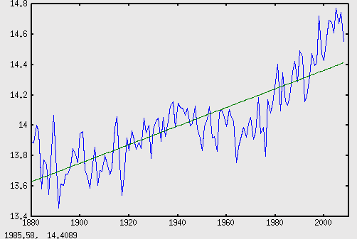
gistemptrend

Looks ok to me. (I also note that even with the so-called “cooling since 1998/2000/2002/cherrypick”, 2008’s average temperature is almost 0.2DegC higher than the linear trend for the last 129 years..)

How Not To do Climate Stats

This is where the higher-degree polynomial equations come in. A high-degree polynomial can easily be made to fit a curve, but that doesn’t particularly mean anything, unless a high-degree polynomial cause can be hypothesised, that matches the trend. I don’t know of any that can.

All this was recently news, because the Australia published a piece of stupid masquerading as climate science.

Anyway, I want to show you how to do that same kind of stupid (albeit with 129 year data, not 30). You can try it with the last 30 if you like. Or with the last two. I don’t care, just don’t be surprised by the results, because they don’t mean anything.

So, we want a sixth-degree polynomial, that best fits the data we have. In other words, we want something like this:

y = rx6 + qx5 + px4 + ox3 + nx2 + mx + b

And we need to find r, q, p, o, n, m, and b. Again, we do it with polyfit(), this time with 6:

EQ = polyfit ( yr , TempReal , 6 ) ;
and we get something like:

1.3740e-16 -7.9135e-13 1.5165e-09 -9.6503e-07 -1.9859e-09 -2.5545e-12 -2.6291e-15

You might point out that these numbers are so small that they are ridiculous. To that, I’d reply: Good point.

Anyway, on with the stupidity, let’s whack those numbers into the above equation:

TempPoly6=EQ(1).*(yr.^6) + EQ(2).*(yr.^5) + EQ(3).*(yr.^4) + EQ(4).*(yr.^3) + EQ(5).*(yr.^2) + EQ(6).*(yr.^1) + EQ(7);

I hope that makes sense, it took me a while to get it.

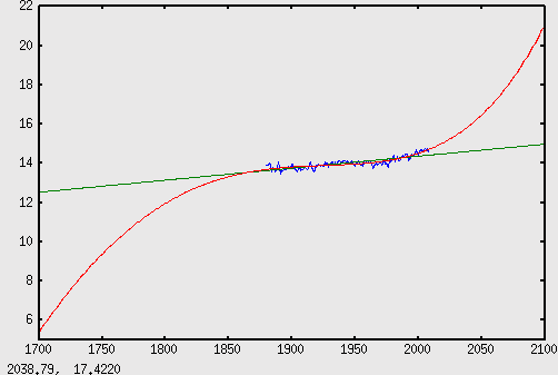
Now we can graph it, along with the real data, and the linear trend line:

plot(yr, AnnualTemps, yr, TrendLine, yr, TempPoly6 );
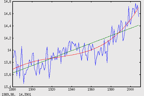
gistemppoly6

Nice, huh? Now, any sane person would see without any stats education would see that an think: yep, that’s a pretty good match. Looks like a good fit to me.

But you already know it’s stupid, so you should be looking at it with even more critical eyes than usual. One of the best ways to be critical in a situation like this is to step back, and take a wide view. So let’s see how those trend lines look if we add another century on each end: 1700 to 2100.

to do this in Octave, you need to stretch the “years” component first, then just put it back into the same equations:

yr = [1700:2100]'

The ‘ is important, it makes the vector matrix vertical. Now you can just hit the up-key to access the same lines as before:

TrendLine = EQ(1) .* yr + EQ(2)

TempPoly6=EQ(1).*(yr.^6) + EQ(2).*(yr.^5) + EQ(3).*(yr.^4) + EQ(4).*(yr.^3) + EQ(5).*(yr.^2) + EQ(6).*(yr.^1) + EQ(7);

Then just run the last plot command again, (yr has changed length though, so go back to the GISSTEMPdata for the years for the original data:

plot(GISTEMPdata(:,1), AnnualTemps, yr, TrendLine, yr, TempPoly6 );
gistemppoly6long

That’s right. By 2100, temperatures won’t be 2DegC warmer, nor 4… Nope, it’s gonna be 21 degrees centigrade – 7 degrees warmer. And the “medieval warm period”? Didn’t exist. Was actually an ice age.

Disclaimer

I’m not a statistician, though I do hope to be doing stats at Uni this year. I’m reasonably sure this is all correct, though I haven’t used this kind of maths since high-school, more than half a decade ago. I learned what I now know in Octave in the last 2-3 days, so there might be better ways of doing this, I don’t know. I’d appreciate any corrections, if they’re needed, and feedback is always welcome.

I’d also appreciate any help on running a LOESS filter on the data. I don’t understand the maths except in the vaguest terms (moving polynomial average, or something?), but it seems like it applies a very useful smoothing, although it doesn’t provide any kind of future prediction the way a linear trend does (ie. in a very limited way).

ATTACHMENT:

gisstempdata.m – THIS IS A PLAIN TEXT FILE, NOT AN ODT. rename it to gisstempdata.m to use it in octave/matlab.

Until now, the technology hasn’t been available to obtain fine-scaled, precise measurements of CO2 in the atmosphere. But the launch next year of two carbon-detecting satellites, NASA’s Orbiting Carbon Observatory and the Japanese Greenhouse Gases Observing Satellite, should soon help to fill in this knowledge gap, which is critical to establishing a reliable carbon accounting system. – Amanda Leigh Mascarelli

There’s more info on the NASA project at http://oco.jpl.nasa.gov/, and on the Japanese project at http://www.jaxa.jp/projects/sat/gosat/index_e.html

It amazes me that this isn’t getting more attention already. It’s going to mean a massive increase in our ability to account for carbon and other greenhouse gas emissions and uptakes. Seems to me that these projects should be WAY more exciting than the Large Hadron Collider, for example, since they will so directly effect the science around one of the most important and controversial issues of this… century? millenium?

It also strikes me that images extrapolated from the data could be strikingly beautiful – in a similar way to the “earth by night” photos. Obviously carbon concentrations won’t be so strictly confined as light sources, and the images will obviously be false colour (since CO2 is invisible). But other effects, like those of coriolis winds and ocean and forest carbon sinks would be great to see in action, especially with changes over the seasons.

Reference:

Leigh, A. et al. (2008, December 18). What we’ve learned in 2008. Nature Reports Climate Change. Retrieved January 12, 2009, from http://www.nature.com/climate/2009/0901/full/climate.2008.142.html.

Next Page »